Showing posts with label color. Show all posts

Cobalt Blue Front Door

I was "reading" a book on how to build sheds the other day, when I came across an image that has stuck with me ever since.
 
It was of this quaint old shed, goldish-yellowy-orange, with a cobalt blue door and window trim and a plethora of red flowers in pots all around it. I'm sorry I don't have a pic to share, but trust me. It was warm, fresh, inviting, and exuberantly unapologetically colorful. Loooooove the cobalt.
 
 
I decided yesterday that, frankly, front doors are huge. I mean, their impact and their ability to set the stage (or not) for the home.

On that soapbox note, here's the dreariness that greeted people to my own home for the past (insert embarrassingly high number) years:
 
 
The weird part is, the people who live inside actually do have personalities! And aren't color blind! Although the random passerby would have no clue about either case.
 
I've actually struggled with customizing our front door space for a while because the rock is a bit dated and represents a color scheme I'm not big into, but it's permanent as far as we're concerned. I also wanted a replacement front door with glass, for more natural light inside. But that would lend zero privacy to much of our upstairs, and that wasn't a great option.
 
What to do, what to do.
What I did in the end was paint the door and ignore the rock altogether. Pretend like it's not there. Because I'm nice like that.
 
So. A quick coat (or three) of blue, and you can see immediate life starting to stir within. Or without. Whatever. Not so happy were the wooden house numbers straight from the 80s. I painted them the same color as the door (obv) but soon realized my mistake. Wowsahs. 


I bought some great contemporary house numbers from Home Depot and was going to hang them up, but I chickened out because (a) I'd be mounting them into stone, and I've never done that before, (b) I couldn't even figure out how to take the old numbers off, and (c) I was going to royally screw up the whole thing. I mean, it's kind of a prominent place to be debuting a hammer drill.
 
So I brushed a few coats of black paint over the numbers to tide us over until I could work up the courage to deal with stone and drills and scariness like that. It's not great, but it'll do.
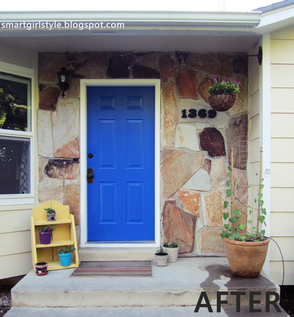
 

Watered some plants, which I realize now makes for a not-so-lovely photo detail. Dah well. I also had some leftover exterior yellow paint from another project, so I gave this sad pot spot a buttery facelift. (mmmm...butter...) And swapped out the welcome mat for a rug I had on-hand until I fall in love with something else to replace it.

Looking better.
 

I thought some color up top would be nice, so I dug up an old hanging basket and hung it from a metal planter-holder-upper thing mounted on the side of the house. (Didn't like how high the flowers would have been if hooked from the ceiling.) I potted some petunias and am sending them all the green-thumb vibes I can muster. Which is about two, total.

 
The lone impatien. Grow, friends!
 
 
And here we are again:
 
 
Still some things to do (like deal with that drip hose and get the flowers to bloom, baby, bloom), but I like where this is headed. It's out there, it's wild, it's bold. But what about you all? Are you a yay or nay on colorful front doors?

{shared: A Glimpse Inside, A Jennuine LifeBe Colorful, By Stephanie LynnC.R.A.F.T., Chic on a Shoestring Budget, Coastal Charm, Craft-O-Maniac, Crafty Texas Girls, DIY by Design, DIY Dreamer, DIY Showoff, Domestically Speaking, Dragonfly Designs, Finding Fabulous, Fireflies & Jellybeans, GingerSnap Crafts, House of Hepworths, I Should be Mopping, Ivy and ElephantsJembellish, Lil Luna, Mercy Ink, My Girlish Whims, My Romantic Home, My Uncommon Slice, Not Just a Housewife, Sew Can Do, Simply DesigningSugar & Dots, Sumo's Sweet Stuff, The 36th Avenue, The Shabby Creek Cottage, The Shabby Nest, The Style Sisters, }
Pin It Now!

World Map Wallpaper

It's beautiful outside, my kids are out of school, and summertime is beckoning, so my computer time these days is rare...and brief.

But I can't help but share this photo with you guys. You all know how I love maps, but the understated color coordination here, the wood, the touch of ikat, the everything -- I love it. It's welcoming, casual, and awesome.
And who wouldn't be comfortable with a bearded sailor bust staring out over your shoulder, being all, "I got'cher back, matey." I mean, honestly. Color me comforted.
Pin It Now!

Mint Greenish Aquamarine in the Living Room

As you know, I'm thinking about painting our living room walls. At first, I thought slightly off-white would be perfect, just because there's already quite a bit going on in my space. Like these:

White is a perfect backdrop for all the eclectic decor and color in the photo below. Honestly, I love this space. I could exist here quite happily for years.

This one is super pretty. More formal than my space, but it breathes serenity and elegance, don't you think?

I like how these warm whitish walls are super crisp and clean, but not sterile:

But after discussing things with a friend and thinking about it for a while, I think white walls would lose all the white accents that are currently in my living room, turning the whole room into one mush of white porridge. Lumpy porridge at that.
 
So now I'm leaning more toward a soft mint green aqua(ish), taking cues from one of the colors of the floral area rug that's in there.

I'm not alone in loving the color, either. Like this chair:

And this wall color (except I'd go lighter; I don't have as many warm wood tones as this space):

This is a little greener than I'm leaning, but the saturation is about right for what I'm after:

Okay, now I'm just posting random pretty pictures. Check, please:

These Eames dining chairs are about spot-on. I'll take 6, thankyouverymuch.

This pale aqua is super dreamy and serene. Not the feeling I'm going for in the living room, but it sure is pretty:

I like the warmth and richness of this one:


Okay, Photo overload. What about you all? Any pale minty aquaish paint colors you'd recommend I look into?
Pin It Now!

How to Decorate a Wood Slat Wall (Reader Question)

Katie recently emailed me some photos of her new entryway and asked me for some advice. While she loves the view when you first enter the front door...
 
 
...she's struggling with the wood slat wall on the right, affectionately known by her family as "the slab." It's a huge (~10' long) wooden partition that divides the foyer from the living room.
 
 
Katie writes: Some people have suggested we rip it out to "open up" the space. But we really like it. Also, the space is open enough, with high ceilings and lots of space. We've also had some suggestions to paint it. But we really like the wood and don't want to alter it that way.
 
 
Katie plans on using this antique dresser (below) to eventually serve as her "landing pad" near the front door for keys, shoes, etc.
 

Here's a view of the back of the slab (looking from the living room into the foyer):
 
 
Okay, first of all, that entryway is HUGE! So grand! Which opens up so many possibilities but also challenges. While I could probably spend the rest of my life (quite happily, I might add) designing and redesigning this entire space, I'm going to stick with the slab.

Here are some similarly-slatted spaces:
 
This dark-stained one is kept completely bare (as in, no bench), and thin horizontal strips emphasize the entire space's contemporary lines.
 

This one uses lighter wood, with slightly wider spacing between the slats for an overall lighter feel.

 
 Katie, I feel like your space currently is pretty heavy on natural elements. It's beautiful - the stone floor, the wood ceiling, yes, even the wood slab. But I would love to see it brought to life with a little bit o' modern, color, pattern, shizam!
 
If it were me, I'd probably remove the entry "bench." It feels a little heavy in an already visually weighty space, and since you don't want it to potentially become a dumping ground (which, frankly, would probably happen in a busy family), then I'd get it out of there.

You asked me about my thought on hanging mirrors or a gallery wall on the slab (haha! lovely name, btw). I think if you go that route, you have to go with the purpose of making an obvious visual statement. For example, if you use mirrors, choose something unique about the mirrors - say, only hang ones that are rounded (circular, oval) or something. Or if you want to go with a gallery wall, maybe choose art with lots of white space or with content that reflects vertical lines to kind of play up the lines of the wood slats. Does that make sense? Basically, I'd keep things very very simple so that the wood slats become part of the overall wall vignette.
 
Honestly, though, if it were my space, my goal would be to have the slab serve as a kind of interesting backdrop to a small sitting area. Seating is not only welcoming in an entryway; it's also functional for doing stuff like putting on shoes or waiting for kids to grab coats before heading out. (I would love my entryway to be bigger than the 3 inches that it is, so I could fit some kind of seating in there. You're a lucky girl!)

Buuuuut...here's the problem. I dreamed up two scenarios, and I can't decide which I like better. Heh.
 
1: Mid-century Modern. Ish. The idea here is to go warm in color, but not boring. Everything is kept fairly neutral with the exception of one stand-out chair, like fire red or cobalt or something that you love that gels with the rest of your house.


1: Throw pillow for the vapor chair - Thomas Paul "botany" (less than $15/yd).

2: "Invisible" chair - To be honest, I have a major crush on the Louis vapor chair and have for some time now. Of course, the Phillipe Stark original is perfection, but at over $400 apiece, I confess I'm finding myself content with a knockoff, like this one for $150.

3: Small side table - tucked between the two chairs, this one is from etsy, vintage brass side table ($65). I happen to adore it. I'm sure you could find something similar; think round and small and metallic.
 
4: Rug - this recycled number is inexpensive ($45) but has a great neutral graphic print. I like how it somehow merges the feel of the wood slat wall and the stone floor.
 
5: Accent chair - this mango retro armless chair ($300) from Target is not a budget item, but it can serve as an example. Look for something chunky and modern. You can scour Craigslist or KSL or thrift stores to find something in a shape you love, then reupholster in a bold solid.
 
6: Sheepskin throw - you can't beat $10 for the Ikea Tjen, and I feel like it does break up the red on the chair a bit. In a good way. (Or go with the Rens or Flokati; I can't remember which one would be best as a throw...because I live a bajillion miles from Ikea and haven't made my annual trek there this year.)
 
7: Sunburst mirror - this Martha Stewart one from Home Depot for just $35 is a steal. I love the spindly, um, bursts? Rays? Whatever. I'd hang this one pretty low, maybe about 12"-18" above the back of the chair, a little off-center from everything (I'm envisioning something in the lower-left corner of the upper-right quadrant of the slab, not centered over the red chair).
 
 
 Okay, so that's one idea. Here's the second one, a little bit bolder, a little more dramatic. 
 
 2: Modern Eclectic. The idea here is to go so far away from the natural neutrality of your existing entry that the seating area looks perfectly at home. Which makes no sense...but it kind of does.


1: Large abstract art - I'd love to see something big and bold, unabashedly bright, hanging on the slab. A chunky gold frame would be even more awesome here (to help one adjust, visually, from the warm wooden slats to the bright artwork itself), but depending on the size of your artwork, that could be pricey.
 
2: Light side table - I love a mirrored console table ($440) here to reflect light and, frankly, just to sit there and be pretty. For a budget-friendly option, you could paint out a regular side table in Rustoleum's Aluminum oil-based paint (found pre-mixed at Home Depot). Though not reflective, it has a great metallic sheen to it.
 
3: Throw pillow - this tropical leaf fabric is a cheerful nod to nature and organic-icity (wow, try saying that ten times fast) (or even once).
 
4: Rug - this black and white chevron area rug (about $70) or a similar striped one is dynamic and vibrant and a classic foundation for the whole vignette.
 
5: Chair - check Craigslist or thrift stores for anything that blurs the line between traditional and contemporary. Like this beautiful antique (1880s!) carved armchair on your local Craigslist...
 
6: ...Reupholstered in something a little modern and unexpected, like this watercolor-print floral.
(I know, antiques purists everywhere hate me right now for suggesting a redo of a genuine antique. These are just examples, though...Katie doesn't have to find a genuine authentically antique piece. She can just find something with similar lines, if she wants. K. History is preserved.) For fun, I'd maybe paint out the wood an unexpected pale lemon yellow.
 
 7: Lamp - this crystal cubed one (on sale for $80) is cool, although now that I'm looking at it all together, I might go with something a little more simple, like a teardrop table lamp.
 

Katie, I can't tell you how fun this was for me, but even more than that, I hope these mood boards of mind springboard some ideas for you personally. Tweak them, make them your own, and enjoy the creative process of personalizing a new space. (And I'd love love love to see a few photos of your completed entry. Sincerely.)

Happy decorating!

Anyone else? Email me: brittneynsmart [at] yahoo [dot] com
Pin It Now!

5 Ways to Incorporate Home Decorating Trends (without being trendy)


Everyone has his/her own style, which is awesome and what makes people unique and inspiring and yada yada yada. But sometimes, a trend will pop up that resonates with us...many of us...for one reason or another.
 
Of course, we can't swap out our entire home decor to go along with that trend (thank goodness...can you imagine?), nor would we want to. But there are ways to incorporate trends into our homes and lives without being trendY. Here are some decorating ideas for doing just that:
 
Trend: Chevron
We've all loved this arrestingly graphic pattern, right? But instead of turning our entire homespace into a senses-assaulting array of zigzaggety-ness (don't worry; I have an English degree. I'm allowed, nay, encouraged to make up words; the more suffixes, the better), it's good to use relatively small and/or deliberate doses of chevron. Throw pillows, for example, are perfect. Buy (etsy or Hobby Lobby, for example) or make 'em yourself. It doesn't get much easier than that.


Premier Prints Black and White Chevron Pillow Cover- 18x18 inches- Hidden Zipper Closure
etsy


Trend: Trendy Colors
Emerald green has been heralded of the color of 2013, which is fine. I like green. But whatever the color-of-the-moment may be, one easy way you can incorporate it without breaking the bank is to use paint chips in one artistic form or another. This allows you to use as much of the color as you want, in a variety of hues and tones, and *bonus* it's a total DIY deal. Which happens to be one of my favorite things.
 
paint chip art
 
 
Trend: Ombre
I'm guilty of wanting to ombre-cize my house from top to bottom, I'll be honest. But hooray for me (and for all of you who visit here), I've refrained from doing so. This trend is particularly effective on one primary item in a space (e.g., furniture, bedding), and a little bit goes a long way as far as visual impact is concerned. Lots of bang for your gradient-laden buck.
 
ombre dresser
 
 
Trend: Neon
What child of the 80s isn't happy to see this one come around? Although, I must say that this trend, more than most, is one to approach with cautious enthusiasm. I don't think I need to explain where overdosing on neon could lead. (Blindness, for starters...) However, when used in carefully selected ways, neon of any color is exciting, energizing, and, well, fun. It's NEON, for heaven's sake! An especially impactful way to incorporate neon is via lighting, like this ghost chandelier. Modern, cheery, bright, but not in-your-face-blinking-OPEN-sign neon. Perfect.
 
not on the high street
 
 
Trend: Ikat
So, ikat has been around forever, but it seems to have made a recent(ish) debut in everyday homes. As a textile, it's easy to use ikat on throw pillows, bedding, etc. But I also (rather?) suggest incorporating it onto upholstered furniture as well, as an unexpected pop of free-moving pattern and color. I happen to love this little chair, for example; it took all of 20 minutes to reupholster the seat from an orangey suede to this hardy ikat. Bingo.
 
ikat chair

So, there you have it. Five simple ways to effectively use trends to freshen your space without being trendilicious. Do you have other quick, easy, and/or inexpensive ideas? I'd love to hear!
 
 
Pin It Now!

Bedroom Makeover: Throw Pillows

Guest Bedroom Makeover
Day 11: Throw Pillows (or: How to Sew a Ruched Throw Pillow)

**Note: This is part of a 12-step bedroom makeover series. Find the previous steps at the bottom of this post.**
 
 
This tutorial is kind of cheating. It's like take-n-bake pizza, where the metaphorical "pizza place" that does all the hard work is this lady's tutorial on how to sew an envelope pillow, and your hypothetical "oven" is my post here on how to do the ruching.
 
Which...mmmmm...pizza.
 
So. First become familiar with how to do an envelope-style pillow. Then combine that knowledge with the simple steps in this post. Then pop something pre-made into the oven and feel domestic.
 
*For explanation purposes, I'm assuming a square pillow form. If yours is different, adjust accordingly.*
 
For the front (ruched) pillow piece, you'll want a rectangle that's as wide as your pillow form (maybe give yourself an extra half inch, but don't go too big) and about 2ish times as long as it is wide. (Longer than that for a more intense ruche, shorter than that for more subtle gethers. Measure to your taste.)
 
Decide how many lines of gathering you want in your ruche. (I wanted 4.) To figure out uniform spacing between each ruche line, divide the width of your pillow by one more than that (in my case, 5) to determine the spacing between each ruche line. 
 
So, for example: if your pillow width is 18" and you want 4 ruche lines, you would divide 18 by 5 for a spacing distance of approx. 3.5". (You can fudge the actual measurements slightly.)
 
Start by doing a baste-stitch along the two sides as close to the edge as you can safely do it. Then measure, mark (pin or pencil on the fabric's wrong side), and baste-stitch (or ruffle-stitch) down each of those lines, which run the length of your fabric piece.
 
Because I wanted four lines of ruching on my pillow, I ended up actually sewing six lines. This is because the two sides must be gathered in order to fit to the pillow's back-side fabric. (They're hard to see on the photo above, but the lines are there in light blue thread.)
 
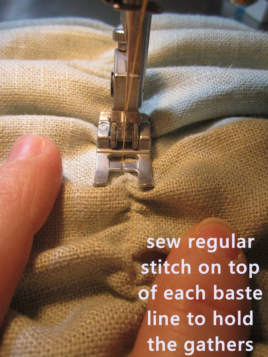
Gather a line until it is as long as the width of your fabric (for example, 18"). Secure it in place by sewing a regular stitch on top (or just to the side) of your baste-stitch. (You can then rip out your baste stitches if you want. I did not, because you can't really see the thread anyway on mine.)  
 
 
Do this for each baste-stitch line. This is the most time-consuming part, for sure. You should have a securely ruched square when you're done. Sew your ruched piece to your two envelope-style back pieces (right sides together), all four sides.
 
 
From the back:
 
Turn it right-side out, and put in your pillow form. Success!
 

Come back for Day 12: Putting it All Together to see the whole room (mostly) completed! This is my favorite day of this whole process, hands down, when I get to share the finish line with you all.
Check out the previous steps to this bedroom makeover:
Day 2: Paint Walls
Day 7: Nightstands
Day 10: Bedding
 
Featured!
Project Inspire   
 
Pin It Now!

Bedroom Makeover: Paint Walls

Guest Bedroom Makeover
Day 2: Paint Walls (and also: How to Repair a Hole in the Wall)
 
**Note: This is part of a 12-step bedroom makeover series. Find the previous steps at the bottom of this post.**
 
Before we get started painting the walls, I had a minor repair job that needed to be done. Hole in the wall from the doorknob's being kicked in a little too "firmly" a little too often. Because I think my 8-year-old son runs an unaccredited underground ninja training camp around here.
 

The hole is too big for a little spackle. Unfortunately.
 
I'm by no means a professional, but we've repaired several drywall holes around here (due to said ninja training and also, well, just life in general), and this is what has worked for us.

Fill in the hole as much as possible with original drywall. Because it was still attached on one side, I pulled out the circle of original drywall from inside the wall and kinda rested it in the hole.
 
Take some drywall mesh tape. It's sticky (like tape, hence the name) on one side. Cut it to be a little larger than the hole you're repairing.


You want it to stick well on all sides. The hole I was working on was almost too big for this strategy, but I just went for it anyway. 


Once tape is secure, use a putty knife to apply drywall mud. You don't want it too thick or too thin here (hah! how's THAT for great direction-giving?). You can always do more coats, and you'll be sanding it each time, no don't stress too much about the thickness.

 
I actually smear it on there in about the thickness of peanut butter on a sandwich.
(Note: My husband actually prefers to make his own PBJs around here because he says I don't put on enough peanut butter. Which I totally do, but he likes his peanut butter, like, 1/2" thick. Eww. No thanks on having my mouth glued shut. "But what's the point of a PBJ if not the peanut butter?" he wonders. "A palatable balance of sticky & sweet," I say.)
(Can you tell this is a point of marital "discussion" around here?)
(But we just celebrated our 11th anniversary, so I think we'll make it through.)
(As long as any picnic we have involves fried chicken rather than PBJs...)
What I'm trying to say is, maybe the peanut-butter-thickness isn't a helpful analogy.
 
Here's the first mud layer:

 
 Now we wait for it to dry thoroughly, then sand it a bit before applying the second coat. Mostly, I sand the edges of the mud area and any outstanding lumps in the middle, but you don't want to sand too far down on the tape.
 
 
Spread on another layer of mud if you can still see the tape lines.
 
 
Let it dry.
 
 
Sand the last of the bumps down. If your wall is flat, you're ready to prime and paint. If your wall is textured, then use spray-on texture (found at any hardware store with the wall repair items) to match it. Prime, then paint.
 
One thing: It's really important to prime over this stuff before painting. Otherwise, your paint over the mud will have a different sheen than the paint everywhere else. Trust me. I speak from painful experience.
 
(Haha, I just accidentally typed "paintful.")
 
Anyway. The End on repairing the hole in your wall. Hopefully you'll be pleased with your results. As for our newly hole-free guest bedroom, it's now a lovely shade of serene bluey-grey ("Husky Grey" by Glidden).
 
 
For your comparison pleasure:
 
 
It's a little less cave-like now, no?
 
 I hope you'll come back for Day 3: Ikea Malm Dresser Makeover. Nothing crazy-intense like you sometimes find Ikea hacks to be, but (I think) it's just perfect for what this space needs.
 
Check out the previous steps to this bedroom makeover:
 
Pin It Now!
Related Posts Plugin for WordPress, Blogger...
Pin It button on image hover