When one thing leads to another...

So there I was, minding my own business and munching on a handful of cookies [Editor's Note: the munching part may or may not be true, I can't remember exactly. But if history is any indication, then, yes, I was munching on cookies. And prolly some fisfuls of granola, too.], when my son poked his head down the stairs. "Mom, have you seen 'Return of the King'? I can't find it anywhere."
 
It was supposedly somewhere in the living room bookshelves, separated from its other JRR Tolkein counterparts because of different-colored spines. After hunting around a few shelves, I began to realize how ridiculous it was that I had "organized" many of our family's books in such a way (by color) that my children couldn't even access the ones they wanted. How can I raise my little army of readers if our books aren't intuitively organized?
 
(Coincidentally, this talented lady felt the same way as me. Gold star for us all, for coming to the same conclusions.)
 
Here's how my living room bookshelves looked previously. So heavy:
 
 
Notice how there are no bright colors? And way too many non-book objects?
 
 
So. I spent a pleasant afternoon a while back reorganizing our bookshelves by (most importantly) book type/topic, such as informative, religious, classic literature, entertainment/light reads, and non-fiction...and after dividing them all up, I put sections back onto the shelves by size and color. Except for the enormous vintage World Encyclopedia set (5th row down on each bookshelf), because you just can't do much with those stylistically except for hide them. And that was no option.
 
 
 I unearthed some books that had been vanquished to the depths of the basement because their spines were too colorful for the previous bookshelf arrangements. I tried to keep the "horizon" of books (the height-line) fairly even across each shelf, sometimes using non-book objects to make this happen. I incorporated fewer trinkets because I wanted it to be, first and foremost, a functional bookshelf and, secondarily, decorative. And I kept book sets (e.g., Lord of the Rings) together.

 
Although there are more books now, I love the change because the shelves actually seem lighter and the living room less stuffy overall. And, after all, who wants to munch handfuls of cookies in a stuffy living room? Not me. I mean, sure, I'd do it. But I wouldn't be happy about it.
 
Fast-forward about a day later, when I realized the newly colorfied shelves needed more colorful surroundings. This realization coincided with a(nother) Banana Incident by my 10-month-old. Translation: My adorbs baby secretly hucks bits of banana off of her high chair tray onto the floor for me to unwittingly mash into the rug with my bare feet an hour or two later. An experience which, btw, is every bit as awesome as it sounds.
 
Anyway, I realized that, although we love the rug under our dining room table, it wasn't going to last a year at this rate. Plus, it's big...bigger than the one in the living room...and more, colorful, too. Hmmmm....
 
Living room rug before:
 

So. I moved the old dining room rug into the living room (after some major baby food cleanupage) and moved the old living room rug into Violet's nursery.
 
 
Eventually, I'd like to swap out the current living room curtains for a lighter, small-print geometric and either replace the living room loveseat with two chairs (ideally) or simply sew a slipcover for the loveseat itself. The ultimate decision will depend on what I can find first - slipcover fabric or two compatible chairs. You never know.
 
 
 Anyway. One of my favorite things to do is rearrange what I've already got, because I can do it in a short amount of time, and it costs nothing for a completely fresh new look and feel.
 
What do you think...noticeable difference or no?
 
 
 By the by...since you're here and all, may I please pick your brains? Do you have any good ideas for decorating an unused fireplace? I've tried a few different things and haven't been thrilled with any of them. Okay. That's all.

Featured!

A Jennuine Life Thrifty to Nifty Thursdays Feature

{shared: A Glimpse Inside, A Jennuine Life, A Little Knick Knack, Beyond the Picket Fence, Chic on a Shoestring Budget, DIY Showoff, Finding Fabulous, Fingerprints on the Fridge, Fireflies & Jellybeans, GingerSnap Crafts, House of Hepworths, I Heart Naptime, My Romantic Home, Or So She Says, Somewhat Simple, The 36th Avenue, The Shabby Creek Cottage, The Shabby Nest, What-About}
Pin It Now!

Basic Reupholstery: Seat Cushion

Reupholstering a Chair Seat: A Beginner's Guide

If you've never reupholstered or recovered any piece of furniture and, frankly, are pretty wary of doing so, I'm dedicating this post to Y.O.U. That's right. You're the Guest of Honor today, baby!

(Just don't let the title go to your head and start asking your children to take over dinner duty while you prop your feet up and sip a sparkling beverage while enjoying six hours of Pride & Prejudice. It won't work. Trust me.)
 
 
My 6-year-old daughter spied chair this at a consignment shop the other day and fell in l.o.v.e. with it. (Except "the L-word" is a bad word around here. Same as "k-i-s," says my 4-year-old. Which kind of made Valentine's Day hilarious, but that's another story for another day.) (Maybe when we're both sitting on our newly upholstered chairs I'll share it with you.) Anyway. Despite the ugly seat, the price was right, so we snatched it up. 
 
 
So. Find yourself a chair with an ugly seat cushion like I did, grab some cute home dec fabric and a staple gun, and follow along with me to upholster your very first chair. A Guest of Honor Chair, in fact! Ready? Let's go.
 
Flip the chair over and detach the seat cushion from the frame with a screwdriver. Lay the cushion upside-down on your fabric and cut, leaving 5-6 extra inches on all sides (or more, if your cushion is extra thick). This is where you'll do your stapling.
 
After making sure your fabric is wrinkle-free, you'll start attaching it to your seat. Staple the two longest (opposite) edges, one side at a time, starting from the middle and moving outward.
 
 
If there's one thing I can tell you about upholstering, it's this: no matter how simple the job, pull taut. Like, really tight. Fabric will move and stretch over a short amount of time if it's not stretched almost as tightly as you can muster during the upholstery process.

Also, you'll (almost) always staple from the center of a side outward to the edges, pulling as you go. This is so your fabric will end up smooth and straight, with no surprise bunching anywhere.
 
After both sides of your seat are taut and stapled (flip the seat over to make sure...if there's even a little bunching, remove the necessary staples and fix the problem now, because it's not going away otherwise!), it's time to think about the corners. Other than lumpiness along the upholstered surface itself, corners are huge in making an upholstery job look professional.

Don't stress, though. If you can wrap a present, you can upholster some crisp corners. Here's my new favorite way to do it:

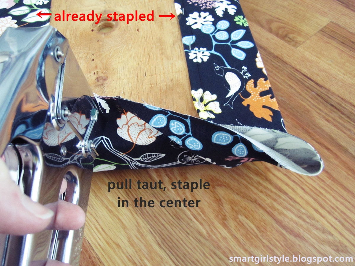
Staple once in the center of one of the open ends of fabric.


(Woah. Weird pinkie finger sitch in the photo above.)
(And also? Apparently "taut" is the Word of the Day. 10 points to whoever ignores the embarrassing number of times the word is used here.)
 
 
You'll want to be simultaneously pulling the fabric toward you during this time and also pulling it toward the corner. Just think "In-N-Out" (in: toward you, out: toward the corner) (or In-N-Out for dinner).


After the corner itself is secure, staple from the center staple toward the corner. Because you've been pulling the fabric tight this whole time (right?), the fabric should lie flat and stapling should be easy.
 
 
Repeat steps for other three corners. Reattach the new-and-improved seat cushion to your chair, and stand back to admire. (And bask in the happy grin of the chair's young owner, if applicable.)
 
Congratulations! You've done it!
 
 
Layla (my daughter) called me down to her bedroom a few minutes after she lugged the freshly reupholstered thing away. She had created a "desk" setup all on her own, using random stuff from throughout the house. (I wonder where she gets that habit?) Like this table from the entryway and this rug from the nursery. Cute girl.
 
 
I'm in the process of rethinking the girls' bedroom space, so even though that table is too shallow even for a piece of paper, we're letting it all stay here for the time being. Regardless of all that, the stool's much cuter now, no?
 
 
When it's warm outside, I may spray paint the wooden armrests. But for now, hooray for a 20-minute project well done.
 
 
Pin It Now!

How to Decorate a Wood Slat Wall (Reader Question)

Katie recently emailed me some photos of her new entryway and asked me for some advice. While she loves the view when you first enter the front door...
 
 
...she's struggling with the wood slat wall on the right, affectionately known by her family as "the slab." It's a huge (~10' long) wooden partition that divides the foyer from the living room.
 
 
Katie writes: Some people have suggested we rip it out to "open up" the space. But we really like it. Also, the space is open enough, with high ceilings and lots of space. We've also had some suggestions to paint it. But we really like the wood and don't want to alter it that way.
 
 
Katie plans on using this antique dresser (below) to eventually serve as her "landing pad" near the front door for keys, shoes, etc.
 

Here's a view of the back of the slab (looking from the living room into the foyer):
 
 
Okay, first of all, that entryway is HUGE! So grand! Which opens up so many possibilities but also challenges. While I could probably spend the rest of my life (quite happily, I might add) designing and redesigning this entire space, I'm going to stick with the slab.

Here are some similarly-slatted spaces:
 
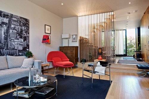
This dark-stained one is kept completely bare (as in, no bench), and thin horizontal strips emphasize the entire space's contemporary lines.
 

This one uses lighter wood, with slightly wider spacing between the slats for an overall lighter feel.

 
 Katie, I feel like your space currently is pretty heavy on natural elements. It's beautiful - the stone floor, the wood ceiling, yes, even the wood slab. But I would love to see it brought to life with a little bit o' modern, color, pattern, shizam!
 
If it were me, I'd probably remove the entry "bench." It feels a little heavy in an already visually weighty space, and since you don't want it to potentially become a dumping ground (which, frankly, would probably happen in a busy family), then I'd get it out of there.

You asked me about my thought on hanging mirrors or a gallery wall on the slab (haha! lovely name, btw). I think if you go that route, you have to go with the purpose of making an obvious visual statement. For example, if you use mirrors, choose something unique about the mirrors - say, only hang ones that are rounded (circular, oval) or something. Or if you want to go with a gallery wall, maybe choose art with lots of white space or with content that reflects vertical lines to kind of play up the lines of the wood slats. Does that make sense? Basically, I'd keep things very very simple so that the wood slats become part of the overall wall vignette.
 
Honestly, though, if it were my space, my goal would be to have the slab serve as a kind of interesting backdrop to a small sitting area. Seating is not only welcoming in an entryway; it's also functional for doing stuff like putting on shoes or waiting for kids to grab coats before heading out. (I would love my entryway to be bigger than the 3 inches that it is, so I could fit some kind of seating in there. You're a lucky girl!)

Buuuuut...here's the problem. I dreamed up two scenarios, and I can't decide which I like better. Heh.
 
1: Mid-century Modern. Ish. The idea here is to go warm in color, but not boring. Everything is kept fairly neutral with the exception of one stand-out chair, like fire red or cobalt or something that you love that gels with the rest of your house.


1: Throw pillow for the vapor chair - Thomas Paul "botany" (less than $15/yd).

2: "Invisible" chair - To be honest, I have a major crush on the Louis vapor chair and have for some time now. Of course, the Phillipe Stark original is perfection, but at over $400 apiece, I confess I'm finding myself content with a knockoff, like this one for $150.

3: Small side table - tucked between the two chairs, this one is from etsy, vintage brass side table ($65). I happen to adore it. I'm sure you could find something similar; think round and small and metallic.
 
4: Rug - this recycled number is inexpensive ($45) but has a great neutral graphic print. I like how it somehow merges the feel of the wood slat wall and the stone floor.
 
5: Accent chair - this mango retro armless chair ($300) from Target is not a budget item, but it can serve as an example. Look for something chunky and modern. You can scour Craigslist or KSL or thrift stores to find something in a shape you love, then reupholster in a bold solid.
 
6: Sheepskin throw - you can't beat $10 for the Ikea Tjen, and I feel like it does break up the red on the chair a bit. In a good way. (Or go with the Rens or Flokati; I can't remember which one would be best as a throw...because I live a bajillion miles from Ikea and haven't made my annual trek there this year.)
 
7: Sunburst mirror - this Martha Stewart one from Home Depot for just $35 is a steal. I love the spindly, um, bursts? Rays? Whatever. I'd hang this one pretty low, maybe about 12"-18" above the back of the chair, a little off-center from everything (I'm envisioning something in the lower-left corner of the upper-right quadrant of the slab, not centered over the red chair).
 
 
 Okay, so that's one idea. Here's the second one, a little bit bolder, a little more dramatic. 
 
 2: Modern Eclectic. The idea here is to go so far away from the natural neutrality of your existing entry that the seating area looks perfectly at home. Which makes no sense...but it kind of does.


1: Large abstract art - I'd love to see something big and bold, unabashedly bright, hanging on the slab. A chunky gold frame would be even more awesome here (to help one adjust, visually, from the warm wooden slats to the bright artwork itself), but depending on the size of your artwork, that could be pricey.
 
2: Light side table - I love a mirrored console table ($440) here to reflect light and, frankly, just to sit there and be pretty. For a budget-friendly option, you could paint out a regular side table in Rustoleum's Aluminum oil-based paint (found pre-mixed at Home Depot). Though not reflective, it has a great metallic sheen to it.
 
3: Throw pillow - this tropical leaf fabric is a cheerful nod to nature and organic-icity (wow, try saying that ten times fast) (or even once).
 
4: Rug - this black and white chevron area rug (about $70) or a similar striped one is dynamic and vibrant and a classic foundation for the whole vignette.
 
5: Chair - check Craigslist or thrift stores for anything that blurs the line between traditional and contemporary. Like this beautiful antique (1880s!) carved armchair on your local Craigslist...
 
6: ...Reupholstered in something a little modern and unexpected, like this watercolor-print floral.
(I know, antiques purists everywhere hate me right now for suggesting a redo of a genuine antique. These are just examples, though...Katie doesn't have to find a genuine authentically antique piece. She can just find something with similar lines, if she wants. K. History is preserved.) For fun, I'd maybe paint out the wood an unexpected pale lemon yellow.
 
 7: Lamp - this crystal cubed one (on sale for $80) is cool, although now that I'm looking at it all together, I might go with something a little more simple, like a teardrop table lamp.
 

Katie, I can't tell you how fun this was for me, but even more than that, I hope these mood boards of mind springboard some ideas for you personally. Tweak them, make them your own, and enjoy the creative process of personalizing a new space. (And I'd love love love to see a few photos of your completed entry. Sincerely.)

Happy decorating!

Anyone else? Email me: brittneynsmart [at] yahoo [dot] com
Pin It Now!

Classic B&W Stripe

Happy Valentine's Day!

Speaking of love...what's not to love about a little classic black-and-white-stripe? 

 
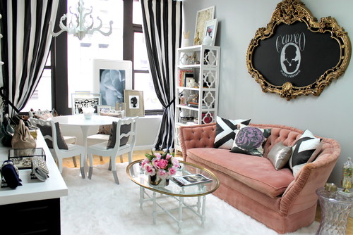
It's a pattern that's been around forever, I know, but it's such a graphic, memorable pattern. Do you remember this space of Kirsten Hollister's in Oprah magazine a few years back? 
 

And how about this striped headboard? Simple, bold, and beautiful.
 
Pinned Image
source
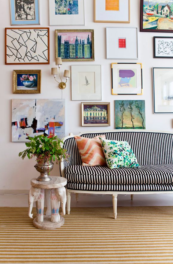
This one (below) of Jenny's from LGN just might be my favorite - I love everything about this photo, from the gallery wall to the throw pillows to the modern slim b&w striped upholstery on a vintage settee.

source

I know stripes can sometimes look a little circus-tent-ish. I think a narrower stripe helps to avoid that, though.

I hope your day is wonderful. I've got kids a little under the weather (again) (or "still," really), so we get to cozy up at home today. Just, y'know, not too close...

Happy Valentine's Day.
xoxo
Pin It Now!

Ikea Hemnes Dresser + A Racecar Stripe

**Addendum: See the complete(ish) bedroom makeover here.**

Question: "Can you paint Ikea furniture?" Answer: Yes!
And what's more, you can do a relatively simple upgrade with big-time impact. Paint furniture, then paint stripes to create a two-thumbs-up Racecar Stripe Painted Dresser. Great for a boy bedroom (at least for the boy at my house), and inexpensive to do.
 
 
Here's what I did: Take your furniture...
 ...and pull out all drawers, then remove all hardware. Lightly sand all surfaces to be painted with 220-grit sandpaper. (I know everyone hates sanding. It doesn't take long, though, to just rough up the surface a bit, and the paint job will be so much better in the ened. I'd recommend it.) You don't want to scratch the laminate, but you want to give your primer every possible chance of adhering to the surface.
 
Prime with 1-2-3 Zinsser primer. One or two coats, and sand any obvious areas. Then pull out your oil paint and spread on your first coat. A few things I noticed:

(1) This was my first time using oil based paint. I used Rustoleum's Aluminum oil paint (premixed, from Home Depot). Everything I read prior to painting talked about thinning out your oil-based paint before painting with it, but in this case, my paint was as thin as thin could be. Seriously. Like water. There was a massive glob at the bottom of the can when I first opened it, so I spent quite a long time stirring to break that up. The glob finally did go away/dissolve, but the paint was still very thin.
 
(2) A high quality paintbrush is the way to go. Not a cheapo brush, not a foam brush, not a roller. And it worked best for me when I just applied the paint and left it alone to dry.
 
 
(3) Let each coat dry com.plete.ly. Like, at least 24 hours. At least.
 
 
(4) I ran out of 220-grit sandpaper (which is pretty fine), so before my 2nd coat of paint, I used the finest grit I had. I'm not sure what number it actually was, but using it was a HUGE mistake. Totally scratched the paint rather than sanded it smooth. Then, like a rookie (and a lazy one at that), I thought that I didn't want to re-sand everything again, so *maybe* if I just painted over the scratches, the new coat of oil paint would fill them in. Nope. Let the record show that oil based paint is pretty much the same as latex paint - what you see in smoothness along the way is what you'll get at the end.
 
 
Crap. But it was a good lesson for me, if nothing else (kind of like how this experience was a good lesson in the importance of priming). So I bought the right sandpaper and came home and resanded everything down to the laminate. Basically, I started over. Which was a huge pain, as I'm sure you can imagine. But the finish ended up perfectly smooth. Yessss!
 
Taped out the stripes with frog tape (my new heart-throb of painters tape), painted two coats of blue latex stripes, and applied a topcoat of polyurethane. If you do a furniture painting project like this involving multiple coats and multiple colors, please please please promise me you won't rush it. In one sentence (above), I summarized about 4 days' worth of work and wait.

All in all, the project took me about 6 days (2-3 were due to my mistake. Oops.). Don't be overanxious, and do let the paint dry absolutely thoroughly between coats. I can't stress this enough. If you don't, and you paint on top of a mostly (but not completely) dry surface, it will be forever tacky when you put stuff on the furniture.
 
 
We really really like the finished result. And that oil paint? I'm a believer. My kids aren't exactly easy on furniture, and this paint job is actually standing up to them.
 
 
I like the impact of the stripe - a little retro, a little boyish, a little detail awesomeness that goes a long way. Plus, bonus, it was super simple to measure out (just four strips of frog tape) and paint. 
 
 
Anyone ever painted with oil based paints that were super duper thin before? Or have yours been thick (like all the places I've read) and needed thinning?
 
Either way: I like this look in my son's bedroom. And so does he. Victory all around.

If you're interested, feel free to check out the rest of his simple yet effective bedroom upgrade.

Featured!
      UndertheTableandDreaming


{shared: A Glimpse Inside, A Jennuine Life, A Little Knick Knack, Angels Homestead, Be Colorful, Beyond the Picket Fence, Boogieboard Cottage, Busy Bees, C.R.A.F.T., Chic on a Shoestring Budget, Coastal Charm, Crafty Texas Girls, Creating my way to Success, DIY by Design, DIY Showoff, Domestically Speaking, Dragonfly Designs, Fireflies & Jellybeans, GingerSnap Crafts, House of Hepworths, I Should be Mopping the Floor, Lil Luna, Mercy Ink, Miss Mustard Seed, My Girlish Whims, My Romantic Home, My Uncommon Slice of Suburbia, New Nostalgia, Not Just a Housewife, Parlo & Logi, Sew Can Do, Sew Much Ado, Shabby Nest, Simply Designing, Somewhat Simple, Style Sisters, Sugar and Dots, Sumo's Sweet Stuff, The Shabby Creek Cottage, Under the Table & Dreaming, What-About}
Pin It Now!

Dining Room Furniture I'd like to Meet...and then Steal

If you've taken my ever-evolving house decorating tour, you may recall this photo of our dining room:
 

Since this photo was taken, I've changed out and trimmed the curtains and added a rug to the space, which makes me happy. But what doesn't make me, like, thrilled is our dining room set. It seems so blah. Too tall for this little room (and too tall for the kids to push themselves up to the table). Not a place you're subconsciously moved into pulling up a chair and staying awhile, even if there's popcorn and a cutthroat round of Boggle going down.

The dining room is one of the first things you see when you walk into our home, but I feel like this setup doesn't reflect us as a family. I'd love to mix and match traditional and contemporary. Have an odd chair or two. Add in patina or color or vibrancy or character. Or (d) all of the above.
 
Hello, Saarinen table and leather Louis chairs (and, while we're at it, sputnik chandy). Welcome to my blog. May I welcome you to my real life? Pretty pretty please?


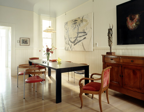
The mix of dining chairs (but all of a similar modern style) is so engaging here.
source

Isn't this set-up pretty? I like the chunky-looking table legs. I'd love to give my husband a velvet upholstered chair at our dinner table. The kids would have vinyl until they've proven themselves worthy. Like in 30 years. But I don't think they'd complain about these cool LC7s.
 
You guys all know I love a rustic-industrial combo. Like this. I don't know how comfy the chairs would be in real life (like that rusted one makes me a little nervous, frankly), but it sure is pretty. Annnnd I would adopt that sweet chandelier if I could. And name him Henry. Henry the Chandy. Has a great ring to it.
source


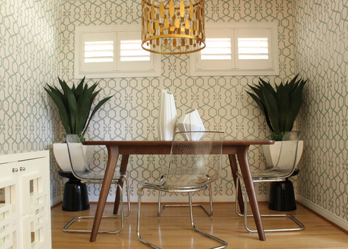
I especially love a more traditional table paired with modern dining room chairs. And quite possibly my very favorite look of all time is a clean-lined stained wooden table paired with vapor chairs. Actually, I love everything about this dining room design - it's not a lot of space to work with (I can relate to that with our dining room), but they've done a lot to make it inviting here.

 
Paul isn't sold on the fact that a new dining room table (and, consequently, chairs) is really necessary for us right now. He's absolutely right, it's not. But it's definitely fun to dream...

What do you guys think? Do you have a favorite dining room style?
Pin It Now!
Related Posts Plugin for WordPress, Blogger...
Pin It button on image hover